


logo concept:
• the identical, mirror-imaged letters 'U' and 'A' unite the parts of the logo into a cohesive whole, just as the brand connects the company and its client through reflecting the latter's needs.
• the dot in the letter 'A' is a subtle detail the team incorporates into the organization to unveil the depth of experiences offered by the products and services.
• the end of the logo is blurred, symbolizing how the team subtly implements changes and blends into the background like a phantom savior.
• the descriptor tells us about the core goal and tool of the work: the client's trust and the company's openness, respectively.
dots as a brand mark.
why dots?
a dot represents the conclusion at the end of every answer, a definitive and precise response given by the team at NU ANSR = NU ANSweR. the dot, like the reinforcing elements in a knight's armor and the holes in a helmet concealing a hero, is also manifested in the form of dots.


brand pattern
using a looped letter 'N', which is reminiscent of the chainmail of knightly rescuers.
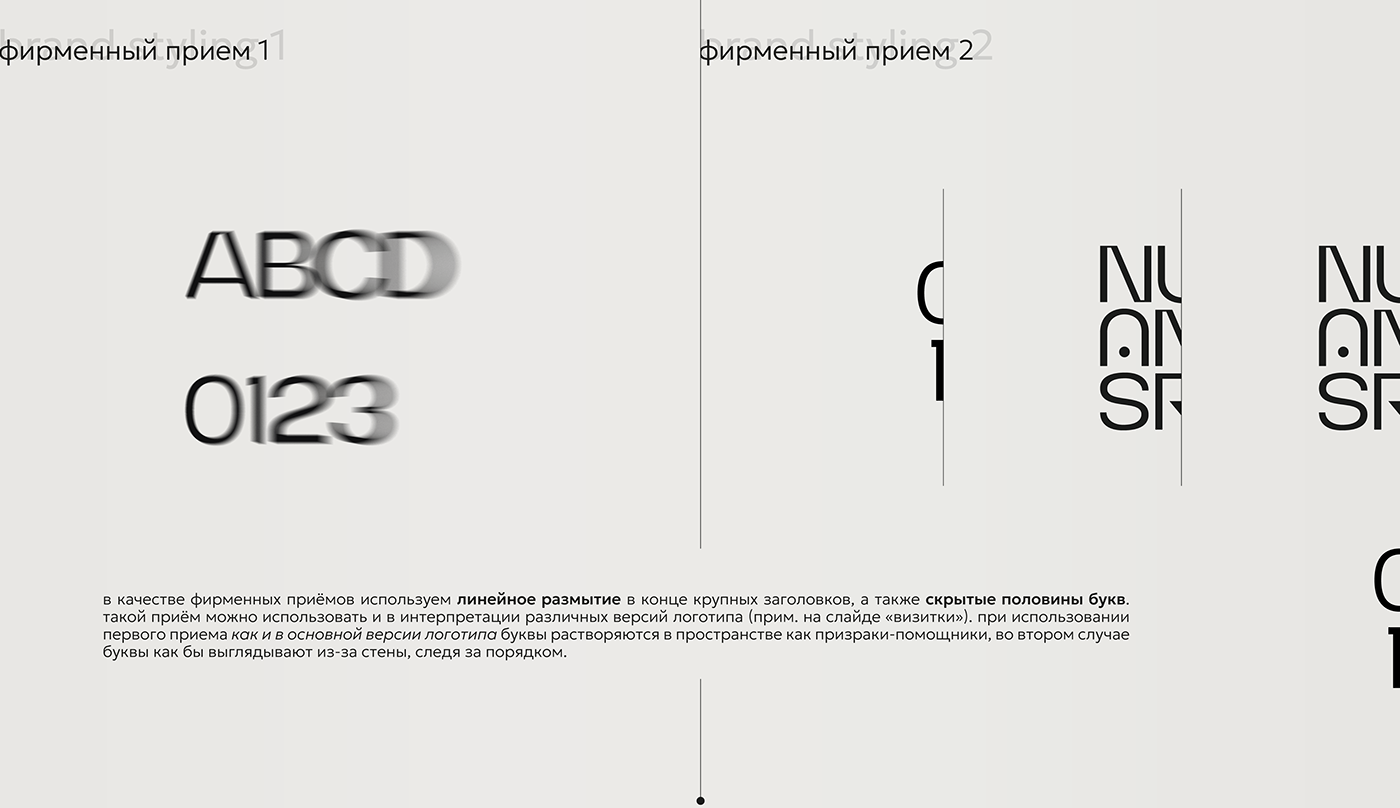
brand stylings
utilizing linear blur at the end of large headlines, along with hidden halves of letters. this approach can also be applied in interpreting different versions of a logo (as seen in the slide with business cards. when using the first technique, as in the main version of the logo, the letters dissolve into the space like ghost knights. in the second case, the letters appear as though they are peeking out from behind a wall, maintaining order.


о бренде: команда профессионалов, которая изучает особенности и отличия организаций и вместо того, чтобы менять процессы полностью, а преобразовывает их, привносит небольшие нюансы, чтобы предложить клиентам не просто товар или услугу, а впечатления и эмоции, отвечает на вопросы и ставит уверенную точку в конце каждого ответа.
задача: разработать фирменный стиль для международного консалтинга по построению клиентоцентричности, клиентского опыта и успеха.
about brand: a team of professionals that studies the unique aspects and differences of organizations, and instead of completely changing processes, transforms them, introducing subtle nuances to offer customers not just a product or service, but experiences and emotions. they respond to queries and confidently place a full stop at the end of each response.
main task: to develop a brand identity for an international consulting firm specializing in building client-centricity, customer experience, and success. the design should embody the essence of client-focused strategies and convey a sense of global expertise and innovation in the field of customer relations and success metrics.


